Let’s face it — bad data creates real problems. When data is messy, outdated, or just plain wrong, it can slow down operations, lead to poor decisions, and cost businesses a lot more than they realise. From wasted time to missed opportunities, the impact of poor data quality is felt across the board.
That’s why data cards shouldn’t just show what a dataset is — they should also tell you how trustworthy it is. Things like how fresh the data is, whether it passed validation checks, or if anything’s missing, give users the confidence to use data without constantly checking in with a data engineer or analyst.
In short, when data cards include quality signals, they don’t just inform — they empower. And that makes everyone’s job a little easier.
The Key Ingredients of Data Quality (and Why They Matter)
Here are some core data quality dimensions that can help people quickly understand if the data they’re using is reliable:
- Accuracy: Does the data reflect what actually happened in the real world? Think of this as how “correct” the numbers and facts are. A low error rate or high percentage of correct values is a great sign.
- Completeness: Are any pieces missing? A dataset that’s 98% complete is very different from one that’s only 60% there. Metrics like missing value percentages or fill rates give a sense of what’s left out.
- Consistency: Is the data telling the same story across systems and time periods? If different systems report different values for the same thing, that’s a red flag. Consistency checks help spot those conflicts.
- Timeliness: Is the data fresh enough to be useful? A “Last updated 5 minutes ago” label hits differently than “Last updated 3 weeks ago.” Timeliness metrics show if you’re working with current info.
- Validity: Does the data follow expected formats or business rules? For example, phone numbers should look like phone numbers, and dates shouldn’t be in the future unless they’re supposed to be.
- Uniqueness/Duplication: Are there duplicates sneaking in? A high duplicate-free percentage means you’re not counting the same record twice.
- Integrity: While this is more behind-the-scenes, it’s about how well the data is protected from corruption or unauthorized access. Strong integrity means you can trust the data hasn’t been tampered with.
Why Showing These on Data Cards Matters
When these quality signals are built into a data card, users can instantly see whether the data is trustworthy — no need to ask around or second-guess. It shifts the perception from “This data exists” to “This data is reliable and ready to use.” That builds confidence and reduces the constant back-and-forth between data teams and stakeholders.
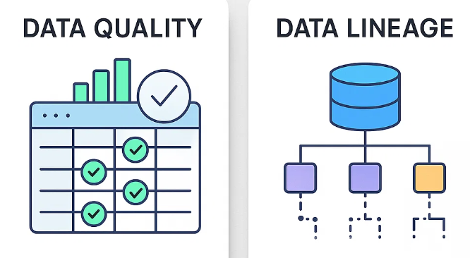
Bringing Lineage to the Forefront
Now let’s talk data lineage — essentially, the story of where your data came from, what’s been done to it, and where it’s going. Think of it as a GPS trail for your data’s journey.
Here’s why that’s so important on a data card:
- Builds Trust: If you can see how the data was created or transformed, you’re more likely to trust it.
- Helps Troubleshoot: If a dashboard is showing weird results, tracing the lineage can help pinpoint where things went wrong — fast.
- Shows Impact: Lineage makes it clear how a change upstream might ripple downstream, so no one’s caught off guard.
- Supports Compliance: For companies that need to follow regulations like GDPR or HIPAA, having lineage visible helps document where data came from and how it’s handled.
How to Show Lineage on a Data Card
You don’t need to overwhelm users. Even a simple visual showing where the data comes from and where it flows to can make a big difference. You can also link to detailed views in tools like dbt Catalog for those who want to dive deeper. Add in a few helpful hints — like when the data was last refreshed or whether the latest transformations passed — and you’ve got a powerful, transparent snapshot.
Bringing It All Together: Visualising Data Quality on Cards
Here’s what a great data card might include:
- A quick overall health label like “Healthy,” “Caution,” or “Degraded”
- Clear metrics: Completeness: 98%, Error Rate: 0.5%
- Timeliness cues: Last Updated: 2 hours ago, Freshness Score: Real-time
- Pass/fail indicators for data tests (even just a green tick for passed)
Turning Data Trust into a Habit
When organisations embed quality and lineage into data cards, they make trust part of the data experience. It’s no longer something users have to guess at — it’s right there, visible and actionable. This kind of transparency not only empowers users to make better decisions but also helps build a culture where data quality is owned, measured, and continuously improved.
This article was originally published at https://medium.com/@aradsouza/data-quality-and-data-lineage-in-data-cards-7f477dc017ef